Business Card Stock and Finishes, Explained in Plain English
14pt or 16pt? Gloss, matte, or soft touch? A guide to the paper weight, coating, and finishing choices that decide how your business card feels in someone's hand.
· 6 min read
By Jeni Wilkins, Nex-Jen Print
A business card is one of the few marketing pieces someone physically holds. Weight, texture, and finish do as much work as the design does, and the vocabulary around them is less complicated than it sounds.
Paper weight: what "14pt" actually means
Point size measures thickness, not weight. 14pt stock is fourteen thousandths of an inch thick. That's the most widely used business card stock, substantial, familiar, and economical.
16pt is noticeably thicker and stiffer. It reads as more premium in the hand and resists bending in a wallet. The step up from 14pt to 16pt is the single easiest way to make a card feel more considered.
Above that are specialty constructions, 32pt and thicker, often two or three sheets laminated together, sometimes with a colored core layer visible at the edge. These are statement cards, priced accordingly.
- 14pt: the standard. Sturdy, professional, cost-effective.
- 16pt: thicker and stiffer. A small upgrade with an obvious feel difference.
- 18pt to 32pt+: premium and specialty stocks, including layered and colored-edge cards.
- Uncoated and cotton stocks: soft, natural texture; the only practical choice if people need to write on the card.
Coating: gloss, satin, and matte
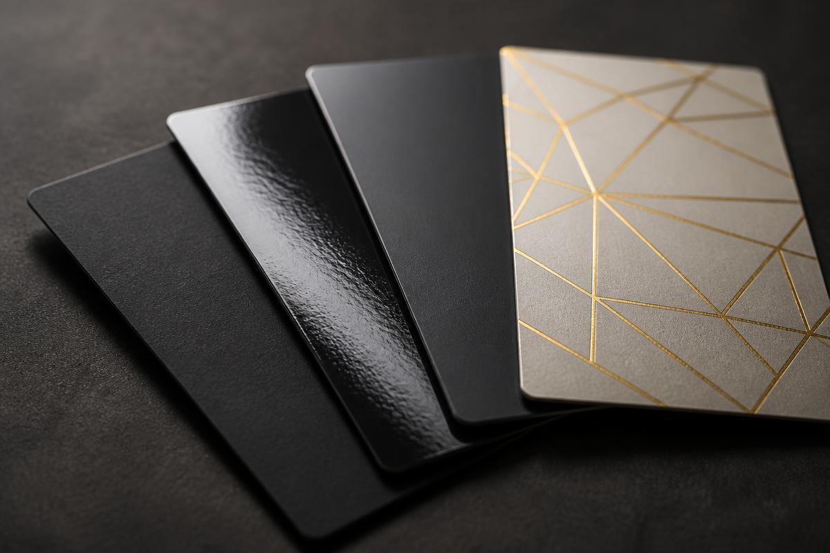
Gloss is shiny and reflective. It makes photographs and saturated colors pop, and it resists fingerprints and moisture better than uncoated stock. It is not writable with a standard pen.
Satin, sometimes called silk or dull, sits between gloss and matte. Slight sheen, smooth feel, excellent color reproduction without the glare. It is the safest default for a card that has to look good in every lighting situation.
Matte has no shine at all. Clean, modern, and understated; colors read slightly softer. Matte shows fingerprints and scuffs more readily than coated stock.
Specialty finishes
- Soft touch lamination: a velvety, suede-like surface. The most memorable tactile upgrade available, and it makes colors slightly deeper.
- Spot UV: a glossy varnish applied to selected areas over a matte card, so a logo or pattern catches the light while the rest stays flat.
- Foil stamping: metallic foil pressed into the stock. Gold, silver, copper, and holographic are common.
- Embossing and debossing: the surface is raised or pressed down, adding texture with no ink at all.
- Painted or colored edges: a strip of color on the card's edge, usually on thick layered stock.
- Rounded corners and die cuts: a shape change people notice before they read a word.
Sizes and layout
The standard U.S. business card is 3.5 × 2 inches, which fits every wallet and cardholder in circulation. Square, slim, and oversized cards stand out, but check that the recipient can actually carry them, a card that doesn't fit gets thrown away.
Whatever the size, build the file with bleed and keep essential information away from the trim edge. Rounded corners need a little extra clearance.
Designing a card people keep
- One clear hierarchy: name, role, then the one or two ways you actually want to be reached.
- Body text at 8pt or larger. Under about 6pt it becomes genuinely hard to read.
- Leave white space. A crowded card reads as cluttered no matter how nice the stock is.
- Use the back. A second color, a short list of services, or a QR code costs little and doubles the usable area.
- If anyone needs to write on it: appointment dates, notes, specify uncoated stock.
How many to order
Business cards get dramatically cheaper per piece as quantity rises, because setup is most of the cost. The tradeoff is change: a new phone number, title, or address makes leftovers useless. Order for the number of months you're confident nothing will change.
Common questions
- What is the difference between 14pt and 16pt business cards?
- Both numbers describe thickness in thousandths of an inch. 14pt is the common standard and 16pt is noticeably thicker and stiffer, which most people read as more premium when they handle the card.
- Should I choose gloss or matte business cards?
- Gloss makes photos and bright colors pop and resists fingerprints. Matte is understated and modern but shows marks more easily. Satin sits between the two and is the safest all-purpose choice. If anyone needs to write on the card, choose uncoated stock instead.
- What size is a standard business card?
- 3.5 × 2 inches in the United States. Square and slim formats are available and do stand out, but they don't fit standard wallets and cardholders.
- Can I write on a business card?
- Only reliably on uncoated or cotton stock. Ink sits on the surface of gloss and satin coatings and smears. If appointment writing matters, ask for an uncoated back.
Ready to order business cards?
Tell us the look you're after, or just send your logo. We'll walk you through stock and finish and quote it for you.
Keep reading
Business Cards in Pueblo: What Local Businesses Need to Know Before Ordering
From Downtown networking events to the State Fairgrounds, Pueblo professionals hand out a lot of cards. Here's how to choose stock, finish, and quantity, and how remote ordering works.
Where to Get Business Cards in Pueblo West (Without Leaving Your Desk)
Pueblo West businesses don't need to drive anywhere for quality business cards. Here's how remote ordering works, what the paper and finish choices actually mean, and how to get cards delivered to your door.
How to Send Print-Ready Artwork: Bleed, Resolution, and Color
Most print delays come from artwork, not printing. This is a plain-language guide to bleed, safe margins, resolution, CMYK color, fonts, and file formats, and what to do if all you have is a logo.